A couple of weeks ago, Microsoft released a new multi-platform tool called Azure Data Studio, this tool is the final version of SQL Operations Studio. If you are familiar to SQLOps, you probably recall that this tool 100% open source, and because of that you can customize the JSON code to do certain things the way it works best for you.
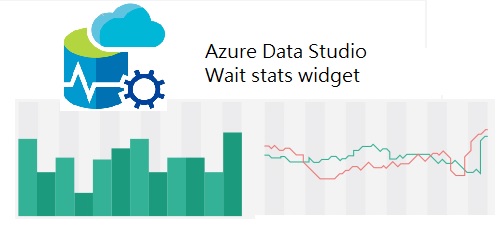
In my personal opinion, this is of the best features of Azure Data Studio are widgets. It gives the option to DBA’s or Database developers to create their own custom widgets to access SQL Server data using simple charts. The old out of the box SSMS Instance reports are good in some way, when you require to check something really quick but the lack of customization and the time they take to load doesn’t make them a really good troubleshooting tool … at least for me. I know how they work and even know how to build a custom report but I think the interface is not that responsive in my personal opinion, when dealing with an issue we need something really really fast.
I decided to give it a try and create a custom widget of wait stats on Azure Data Studio, because I use them everyday and also are one of the most common troubleshooting methodologies across SQL Server data professionals. If you are not familiar with wait stats, you should … it provides diagnostic information that can help to determine the root cause or symptom of a potential bottleneck in multiple areas like:
- Locking \ blocking issues
- CPU pressure
- Memory pressure
- Disk IO problems
In this post, I will walk you through the creation of a custom widget to display the top 5 wait stats from your system but first you must have Azure Data Studio installed on your computer already. So in case you don’t please make yourself a favor and download the macOS version on this link.
From now on, I will assume you have Azure Data Studio installed also a working connection to a SQL Server instance. All the Azure Data Studio widgets uses a query file as a source, in this case I created a short version of world-famous Paul Randal’s (b|t) script to determine the wait stats for a SQL Server instance, you can download the modified script here from my GitHub repository.
This short version will show only the top five wait types from your system, I also I removed the links from Paul’s version where he explains each ignored wait type just to make the code easier to read but I strongly recommend you to check Paul Randal’s blog post to learn more about.
Download the script and move it to a known location rather than your Downloads folder, this will make things easier while creating the widget. A folder location like /Users/MyUser/Documents/wait_stats.sql would work.
Open the script with Azure Data Studio and execute it, then go to the results window look at the top right corner of this section and click on the Chart icon:
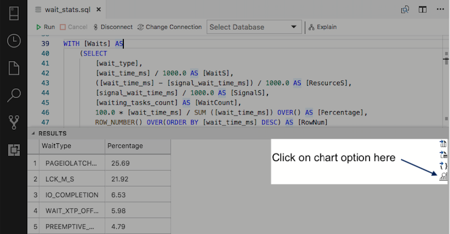
Once the chart is displayed in the screen, look for the chart options from the right panel and make the following changes:
- Chart Type = horizontalBar
- Data Direction = Vertical
- Legend Position = none
- X Axis Label = PERCENTAGE
- Y Axis Label = WAIT TYPE
As you may noticed at this point, a nice horizontal bar type char is displayed on your screen, but this is just halfway now let’s move ahead and get the widget created. Click on the Create Insight button at the top of the RESULTS \ CHART grid to generate the JSON code for this chart.
Azure Data Studio will open a new windows with some JSON code, probably you noticed the way it is showed in the screen is not that readable. Don’t you worry, we can address the format problem just select all the JSON code using the ⌘ A (Command + A) shortcut then just run the Format document function of Azure Data Studio using the ⇧⌥ F (Shift + Alt + F) shortcut and voilà the code is now looking perfectly formatted:
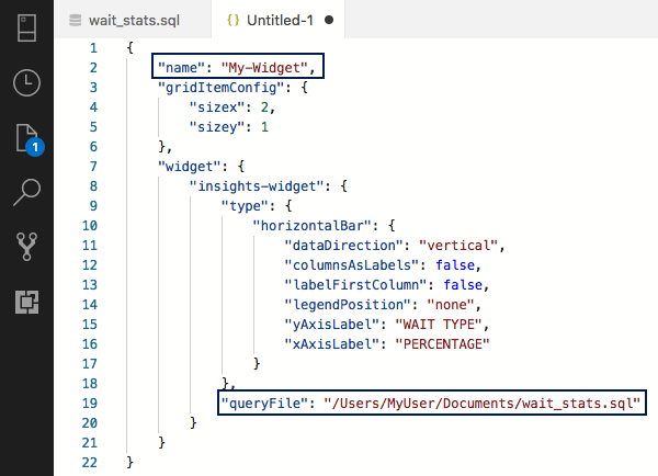
Noticed that I have highlighted the name key, because the auto-generated code puts My-Widget as value by default in our case we want to call this widget something like Wait stats, also noticed the queryFile key value it points the location you saved the wait stats script at the beginning of this post.
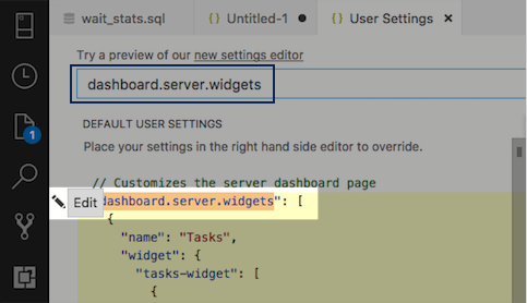
Finally it’s time to add our custom Wait stats widget to Azure Data Studio, open the Azure Data Studio command palette using the ⌘⇧P (Command + Shift + P) and then write Preferences you will see a list of options displayed as a list choose Preferences: Open User Settings from the list.
In the Search Settings text box write dashboard.server.widgets then click on dashboard.server.widgets and select the Edit option:
The left panel will turn yellow in Edit mode, now look for the last bracket from the last widget on the last panel in my case the all-database-size-server-insight. Carefully add a comma symbol after the last bracket, then copy the JSON code from the other window and paste it. It should look something like this:

Then simply save the changes to the user settings using the ⌘S (Command + S) shortcut, close all the open windows. Re-connect to one of your SQL Server instances, right click then choose manage it will display the server dashboard now just look for the widget we just created.
I hope you find this tip useful, in case you want to grab a copy of the SQL and JSON file used in this post you can find it here.
Stay tuned for more DBA mastery tips!
Carlos Robles is a Solutions Architect at AWS, a former Microsoft Data Platform MVP, a Friend of Redgate, but more than anything a technology lover. He has worked in the database management field on multiple platforms for over ten years in various industries.
He has diverse experience as a Consultant, DBA and DBA Manager. He is currently working as a Solution Architect, helping customers to solve software/infrastructure problems in their on-premise or cloud environments.
Speaker, author, blogger, mentor, Guatemala SQL User group leader. If you don’t find him chatting with friends about geek stuff, he will be enjoying life with his family.
Great! Thanks! Only, my editor refuses to switch to edit mode. I hover over, “Edit” appears, I click on it, but it does not change to edit mode. Any hints, please? TIA, Raphael
Hi! sorry for the very late reply. Well, I think it is confusing the first time but once you click on “Edit” you have to look at the panel in the right and make sure it allows you to change the text there.
I also recommend you to update Azure Data Studio to the latest version, in case it doesn’t work for you I’m happy to assist you, we can probably connect through Google hangouts and work it online.